Showing posts with label color throwdown. Show all posts

Monday, July 15, 2013

Cupcake Cutie

Oh how I love tutorial challenges! I rarely actually get around to entering them, but I thought that the Circle Step Card and/or Circles/Hexagons challenge at Top Tip Tuesday was perfect for a birthday card for our niece.


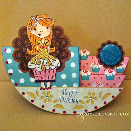
The "Cupcake Girl" clear stamp is from my stash; I know it was made by someone in Arizona, but sadly it doesn't say on the package. I've ended up loving this stamp more than I thought I would; it's so much fun to paper-piece (you can see another version here), and is easy to personalize. The dress, frosting, and wrapper are all pieced on from different papers, and the body & hair is a 100% Hammermill. I colored the image & dress with Copics, and added detail with Sakura glaze pens.

I made the base with Echo Park's double-sided Teal Small Dot DP (the inside is striped). The cupcake paper is from Digi Doodle Doo's free . I cut out some more tiny cupcakes and glued them on top of the paper to add dimension. The Cupcake Girl's wrapper is stamped on a digi paper I made by enlarging the same cupcake paper.

The bottom, flower-patterned portion is made from a textured, white-frosted yellow Core'Dinations cardstock. I punched the pattern with the "Flower" Mini Lucky 8 Punch from We R Memory Keepers, and backed it with the the yellow side. I used both sides for the frosting & dress on the Cupcake Girl.

The patterned kraft medallions die cuts are from my stash; I splurged on $2 worth of them at Scraps of Love, and I've been hoarding them for over 6 months! The 3D "You're the Best" epoxy sticker on the small doily is also long-hoarded. I embellished the card with adhesive gems and a silver "Happy Birthday" sticker.


I think our niece will like this card, as her family likes to bake!


Color Throwdown #250
Inspiration/Challenges:
Color Throwdown #250: Teal, Kraft, Hot Pink, Light Yellow
Quick Quotes: Add Dimension to your project
Top Tip Tuesday Challenge 105: Hexagons and/or Circles (and Circle Step Card tutorial)
Word Play Saturday: Birthdays

Thank you for visiting,


Friday, March 1, 2013

Arizona colors

I was really intrigued by this week's "Your State" challenge at Speedy Fox and Friends, so I tried my hand at an idea my friend had while he was visiting. I have some cut-out masks from a cityscape project, and I used that to make a mountain like you see in Arizona. Although I now live in Maryland, I consider Arizona my other home... that's where my folks live, and where I was living when I met my friend. I used the same wood-stamping technique that I used on my Portlandia card to make the little "quail".


Inks: SU! Barely Banana, ColorBox, Versamark watermark ink, Versamark chalk ink
Wood bird used as stamp: Prima
Stamps: sentiment from Verve's Let It Shine set, cactus from My Favorite Things' Fred Bear Out West set, bubble border by Annabelle Stamps
Papers: SU! Whisper White, Core'Dinations
Embossing Powders: ZING! Brown Sugar, Lemonade Scentz by ColorBox  
Dies/Cutting Files: Card frame and Cityscape/Mountains designed in SCAL and cut on my Cricut, Banner die from a•muse studio, Button from SU! Embosslit, scallop scissors for corner rounding


Inspiration/Challenges:
Annabelle Stamps Challenge #157: Sketch
Color Throwdown #231: Melon Mambo, So Saffron, Crumb Cake, Lucky Limeade
CAS-ual Fridays #92: Stamp your own background
Speedy Fox and Friends Challenge 148: Your State


Thank you for visiting,

Monday, October 15, 2012

One-layer Thank-you

My 35th birthday was last week, and one of my presents was Cuttlebug's All-in-One embossing system, which I can use with my beloved Big Shot (more info here). Thanks Mom!!!  I really love dry embossing (adds so much texture & visual interest), and the chance to have a bit more control over the design was too good to pass up. I got one of their Font sets, so I just had to try the "letterpress" technique right away. Basically, you ink the letters and then deboss it. I think this came out really nicely for my first try.


I'm very happy with how easy it is to line up the paper in the All-in-One (with the help of blue/painter's tape of course!), making it possible to make this a one-layer card. The base was cut on my Cricut with A Quilted Christmas (another present; thank you Mom again, and Jo-Ann's for their sales and generous coupon policy!) The leaves are a ribbon, and I filled in the design with an orange glitter pen (Elmer's), so the inside is pretty too! Many thanks to Color Throwdown for their fabulous color combo this week, it really inspired me.

Here's another view:


Inspiration/Challenges:
Addicted to Stamps and More - CAS
Color Throwdown #213 - Melon, Lime, Pumpkin
Little Miss Muffet Challenges -  One layer or CAS


Thank you for visiting,

Thursday, May 31, 2012

My first attempt at quilling!

I've been threatening to try quilling ever since I started following Helen's fab blog, Let's Create, over a year ago, and after a few false starts I've finally made a project featuring the technique.

Mom gave me the quilling paper & tool, which she got free with an issue of Crafts Beautiful magazine, but even with the "right" tools I found that it was trickier than I had hoped... but Helen has offered many good tips, and I'm really quite thrilled my my first attempt!


I wanted to keep this card very clean and simple, so there's no edging or nuttin'. For the banner, I cut the shape out of white cardstock, ran it through my sticker machine, and smoothed on the natural cotton material. I folded the edges in, adhering them with double-sided tape. I stamped the Stampin' Up! sentiment with brown Memento ink, added some rafia, and glued the butterfly on with Glossy Accents. Easy-peasy!

Inspiration/Challenges:
Amusing Challenge: Sketch (right)
Color Throwdown #194: Crumb Cake, Poppy Parade, Very Vanilla, Soft Sky (left)

Update: This was one of only 2 entries, but I still won Amusing Sketch Challenge #3! Was in great company with E.T., my Feline Playful teamie.

Thank you for visiting!

Friday, January 20, 2012

One for the Moms

So have you entered the Dude Time Doodles BINGO Challenge yet? The Design Team examples are so awesome! I was particularly inspired by Anne's cute shaped card featuring Gladys Salt by Dude Time Doodles/Bonibleaux Designs, so I just had to use the image myself. Here's my card, with Walt in the background:
I was intrigued by the current Color Throwdown combo of Ivory, Kraft, Olive & Red, and thought it would look good with the "Stripes & Pearls" theme at Card und More.

I colored Gladys with watercolor pencils, and distressed all the pieces with Antique Linen distress ink. The flower was cut on my Cricut from glassine paper using the Walk in the Garden set. I scrunched up the paper, stacked the pieces, secured them with a brad & glue, and sprayed the flower with a green Tattered Angels glimmer mist. For a final touch, added an adhesive pearl in the center.

I generated the sentiment with Folkard™ font. It's a favorite quote of mine, attributed to Mark Twain: "My mother had a great deal of trouble with me, but I think she enjoyed it." The look on Gladys' face is exactly the look Mom gave me when I quoted that to her! Ha ha!

Saturday, October 29, 2011

Autumn Camus #3

This is my third card using this Albert Camus quote Wordart freebie from Paper Makeup (my first card is here and my second card is here).For my color scheme, I followed Color Throwdown #165: Pool Party, Peach Parfait, Daffodil Delight, Old Olive.

I printed the sentiment onto China Blue linen cardstock from Mark's Finest Papers. I love this stuff. The blue changes depending on the light; for example, in these photos it looks almost white but in my living room it's a baby blue.
As with my second card I used the Vase with Gerbera Daisy stamp SP & Company's For Every Woman set so I used masking to incorporate a leaf stamp. I then used a reverse mask (Thank goodness for adhesive masking paper! Worth every penny!) over the whole thing and heat-embossed some green polka dots onto the vase (I did this for the Polka Dots challenge at Less is More, but totally flaked on the deadline!). This was tricky, but I love the see-through feel.

Because I was making this for Less is More, I tried to keep it CAS (Clean & Simple), which is why everything's stamped onto one layer. This seems simple, but it's certainly doesn't allow for mistakes! I colored the details with Copics, and punched the corners with my Martha Stewart flower corner punch.


The photo is too bright, but all the interior mats are embossed with polka dots:

Saturday, September 10, 2011

Two Grays and some Penny Black

The current challenge at the Penny Black blog is "Simple Stamping," and I decided to try a relatively Clean-and-Simple (CAS) card. I used the lovely if unusual color combo from Color Throwdown, and the intriguing sketch from Sketchy Tuesday.


Inspiration:
Penny Black: Simple Stamping
Color Throwdown #158: Island Indigo, Peach Parfait, Basic Gray, Light Gray
Sketchy Tuesday #92

Stamps: Stampendous!
Paper: Bazzill, DCWV, Core'dinations, stash cardboard
Tools: Fiskars papercutter, stamp block, MS detailing scissors, Crop-O-Dile
Other: ZipDry glue, Memento ink, tulle, stash eyelet, Copic for edging

Thursday, July 14, 2011

Retro Vintage Shabby-Chic

I've really been inspired to craft today, and made these two cards. I'm distressing machine now that I have my handy paper distresser. Oh Tim Holtz, you are so much wiser than your years!

This week's combos at the Color Throwdown and colourQ are really challenging & really wonderful, and I had lots of fun pulling out some long-hoarded papers from my stash and just letting the card come together (with a little help from the sketches at Top Tip Tuesday/Robin's Fetish and Mojo Monday!)


I haven't had much luck taking photos today: everything either looks washed-out or technicolored. But I'm pleased with how the colors match the challenges' in real life. The card above uses mostly paper from the 5&Dime October Afternoon collection (wow, it really came through for me with this otherwise challenging combo).

When I saw the classic-black rotary phone image, I just had to make a "missing you" card. I covered the phone image with Glossy Accents to create a faux-epoxy embellishment. It looks & feels really cool, but it took hours to dry.

Totally off the crafting subject, I love that the classic-black rotary phone not only evokes a retro feeling to me, but also feels vintage. My mom (Ann, because she actually has a name other than Mom, much to my dismay!), was telling me about some children who were scoring low on standardized tests that used images of rotary phones. What 4-year-old now would recognize a rotary phone?! Which makes me feel...experienced.

Inspiration: Color Throwdown #150, Top Tip Tuesday/Robin's Fetish Sketch
Stamps: StudioG, Paper Studio, sentiment from Regal Greetings set by {ippity} Stamps
Paper: Recollections, Core'dinations, 5&Dime
Tools: Marvy heat tool, Fiskars papercutter, Tim Holtz scissors & paper distresser,
Other: ZipDry glue, Stampendous embossing powder, Gary M. Burlin & Co. brads, Making Memories buttons, Simplicity thread & needle, Versamark & Stampin' Up! inks, Glossy Accents


This card is all about the paper: each piece has its own wonderful texture. The medallions are heat-embossed with silver and colored with Copics.
The sentiment is actually a (clear) horizontal stamp
that I partially inked and stamped to fit into the circle frame. Um, yeah, that took a little doing! But I'm pleased with the result.

Inspiration: ColourQ #93, Mojo Monday Sketch #199
Stamps: Hero Arts, Paper Studio, K&Co., large medallion from stash (thank you Spotlight Challenge)
Paper:
Recollections, Core'dinations, handmade from stash
Tools:
Marvy heat tool, Fiskars papercutter, Tim Holtz scissors &
paper distresser
Other: ZipDry glue, ZING embossing powder, Versamark ink, Copic pens, Offray ribbon, pop-dots

Thursday, June 16, 2011

Go Daisy Go!

I couldn't believe my luck when I found this freebie by Just Inklined. Isn't she just the cutest‽ Reminds me of so many wonderful bike rides when I was a kid, and that feeling of absolute freedom. In fact, it makes me so happy that I'm entering into this week's Make It Monday Link Party. Helloooooo everybody! (And Anne-Marie, I saw you won a prize. Congrats!)

The paper is a piece of the delicious new Dots & Stripes paper pack from Echo Park. I colored the button brads and the edges of the pop-foam with matching Copics. I left the message banner loose, so it swings on the brad. Couldn't pass up an opportunity for some interaction!

Inspiration:
Color Throwdown #146: daffodil, tangerine, kiwi
Mojo Monday Sketch #195

Stamps: Speed Demon AKA Daisy Bumblethorpe digi by Just Inklined, sentiment from Highway High set from Raisin Boat
Paper: Dots & Stripes from Echo Park, Hammermill, Recollections
Tools: HP printer & ink, Marvy heat tool
Other: ZipDry, Stampendous embossing powder, Versamark watermark ink, tulle, button brads from Oriental Trading Co., Recollections pop-foam
Copics: c-1, c-5, c-7, yg03, yg63, bg10, yr12, y17, y08, y04, y000, yr04, yr09, e17, e35, e33, e11, e02, e51, rv23

Saturday, June 4, 2011

Remember what the doorknob said: Feed your head

I've been salivating over projects that use Glossy Accents for some time, and I finally got my hot little hands on some. This is how the phone conversation with my mom went yesterday:
cg: So have you heard of this 3D adhesive called Glossy Accents?
mom: No...
cg: Folks use it to create a wet effect...like, you can add some on an umbrella and it looks exactly like raindrops.
mom: Eeeeeeeee!!!
cg: My thoughts exactly. I saw one card where the crafter used it on rainboots and it looked so real I thought I was going to have a heartattack.
mom: Okay, I have a pencil to write this down. Did you get it on one of your fancy online stores?
cg: No! Apparently it's been in the Tim Holtz section of Michaels for ever. I even used a coupon.
mom: Oh! Well. Guess I'll be making a stop!
*
I haven't spoken to her today, but I'm quite sure that we're both going to be spending much of the evening with our Glossy Accents! That's how I spent much of yesterday, using my new favorite product for the goggles & plane blades for these cards I'm sending to Card Cupids:

This card design was inspired by several challenges: the square-and-triangle-themed Mojo Sketch; the bright combo at Color Throwdown; the "ribbon or fiber" challenge at Card Cupids; and the Texture theme at Delicious Doodles. I added as much texture as I could muster: heat-embossing, puff-paint (Marvy snow pen), flocking, Glossy Accents (of course), paper piecing, and texture embossing. Love love love my Sizzix.

I made six, and although each card varies slightly, to make life easiest for the various visiting DTs I'm entering this particular card (below) in all the challenges that inspired the set.

I couldn't not make the rabbits white. I won this little guy by entering the CDAC Special Occasion Challenge sponsored by Zlatoena Designs. I adore her work and her blog. Thank you Zlatina!

And although I said that I was sending all 6 to Card Cupids, I'm actually sending one to Mom. How can I not?!

Inspiration:
Sketch: Mojo Monday #193
Color: Color Throwdown #144: Pumpkin Pie, Melon Mambo, Certainly Celery
Theme: Delicious Doodles Challenge #28: Texture
Embellishment: Card Cupids New Challenge Sunday: Ribbon or Fiber

Stamps: Rabbit Traveler/Air plane by Zlatoena Designs, Howdy sentiment from My Favorite Things, Hello Friend sentiment from StudioG
Paper: Hammermill, Recollections, stash designer paper (Paper Studio?)
Tools: HP printer & ink, Marvy heat tool, Sizzix Texture Boutique & starbursts embossing folder, Fiskars paper cutter, decorative edge cutter, MS detailing scissors
Other: ZipDry glue, ZIG glue pen, Glossy Accents, Stampendous or ZING embossing powder, Versamark watermark ink, Marvy snow pen, Elmers or Sakura gel pen, bakers twine from Soiree collection by House of 3
Copics: RV29

Friday, April 29, 2011

A sketch so nice...yadda yadda twice

My lucky number is 3 so I love challenges that incorporate it, such as the Sketch over at All Things Unity. I designed one card using their stamps, but then found that the sketch popped into my head for the Terrifically Thrilling Thursday Challenge at Shelly's Images. So thank you ATU for the inspiration!

I went "simple" for both of these cards, and really enjoy how they came out; almost like what I imagined in my head!

Sketch: ATU #29
Theme: Use a Punch, Card Cupids New Challenge Sunday
Color: colourQ Challenge #82: Always Artichoke, Kiwi Kiss, Pear Pizzazz, Baja Breeze & White

Supplies: {ippity} rubber cling stamps, Heidi Grace Designs glitter paper, Recollections cardstock, Memento ink, Marvy brush markers & punch, ZipDry glue, Fiskars papercutter & punch, MS detailing scissors


Theme: Buttons, Brads & Bows, TTT Challenge Thursday at Shelly's Images
Color: Color Throwdown #139: Dusty Durango, Tangerine Tango, Chocolate Chip, Pear Pizzazz, Crushed Curry

Supplies: digi stamp by Shelly's Images, silicon sentiment stamp from stash, Heidi Grace Designs glitter paper, Recollections, Hammermill and Brazzil cardstocks, Offray ribbon, ColorBox chalk ink, ZipDry glue, Fiskars papercutter, MS detailing scissors, HP printer & ink, stash button & brad

Sunday, April 10, 2011

Can I resist / 4 challenges

Thanks to the generous comments on my recent stamping/sponging endeavor, I'm feeling pretty jazzed and ready for a new challenge! Or, in this case, four challenges. What can I say, I wanted a lot of inspiration! And I sure got a wonderful bunch:
  1. Speedy the Cat's Friends Challenge #50: Emboss Resist Technique
  2. All Things Unity Challenge #28: Unity/{ippity} stamps + Buttons
  3. Color Throwdown #136: Orange, Soft Sky, Kraft
  4. Critter Sketch Challenge #59: Fancy Folds

I really enjoyed making my first Center Step card last week, and I thought the fold would look really good with the {ippity} stamps I won from CPS/Banu. Love these stamps.

I probably should've done the emboss/resist on white paper, but I really wanted the kraft-y paper to come through (I'm out of real kraft, so I used Core'dinations to match the other papers). I do adore this technique; you just stamp it with watermark ink and clear-emboss it. After you apply the ink (I use cheap-o makeup sponges), just wipe off the stamp with a papertowel. And it really really works! The actual stamping portion of this card only took about 10 minutes.

I stamped the flowers in blue & orange onto the "kraft" paper, clear-embossed them, cut them out and sewed them, along with little flower buttons, onto the orange paper. It was a freakin' miracle that I happened to have matching thread. Wow! I also pulled out my fancy corner punch and a border punch (for the inside details), which always make things look good. I made this card for a friend's daughter, who just had shoulder surgery; I don't know her personally, but she's about my age so I made something I'd like!

Center Step card tutorial: Creative Moments with Sandy

Supplies: Regal Greetings set by {ippity} Stamps, Core'dinations glimmer cardstock, Stampendous clear detail embossing powder, ColorBox inks, Versamark Watermark ink, Martha Stewart detailing scissors and border punch, Fiskars papercutter and corner punch, ZipDry glue, Marvy heat tool, thread by Coats & Clark, needle, emery board

Update 4/20/11: This card made the top three for All Things Unity Challenge #28. Thanks!

Monday, March 21, 2011

Butterfly Stack

Wow, I had a super duper weekend! I met lots of new crafters thanks to Stampin' Dymonz Scrap Shack's Mad About Paper Blog Hop, and find myself with several new followers. Helloooo everybody!

I didn't do really any challenges last week, so this week I decided to start anew with the sketch challenge at CDAC and the color combo at Color Throwdown. The freebie Butterfly digi stamp offered by McMahon Five Designs for the CDAC challenge really lent itself to this lovely palette. Thank you!

Since I was working digitally anyway, I took the color combo image into PhotoShop and matched the colors: I used the eyedropper to grab the color and then put it as a color overlay onto the butterfly (Layer/Layer Style/Color Overlay/Screen mode). I always printed butterflies in the combo colors onto the inside of the card.

I was inspired to try stacking differently colored layers by Anne Baity on CDAC (here's her incredible cherry blossom card on CDAC; I'll post her blog if I can find it.)

I used physical stamps for both the tag and and the sentiment, which was super fun. The sentiment is also clear-embossed, because why not!


Digi stamp: Butterfly Breeze by McMahon Five Designs

Inspiration:
Color:
Color Throwdown #133
Sketch & image: CDACsc19

Supplies: Paper Studio. Brazzill and Core'dinations cardstocks, ZipDry glue, embroidery thread, StazOn ink, Martha Stewart chalk ink and detailing scissors, CraftSmart(?) scalloping scissors, Crop-O-DileII (for border on plum pieces), SCAL & Cricut, 09KutUps font (for scalloped circles), Adobe PhotoShop & InDesign, HP printer & ink, emery board, pop-dots, Copic markers for (coloring pop-dots)

Saturday, February 26, 2011

Thinking of blossoms...

One of my favorite parts of living in Baltimore is the brief and beautiful flowering of the trees. Neighboring D.C. is famous for their Cherry Blossoms, but Baltimore puts on its own show...my favorite part is the "Spring Snow," when the blossoms drop and the streets are filled with pink, peach, and white petals.

With Spring just around the corner, this seems the time to practice with my new Cherry Blossom Branch stamp. I couldn't have asked for a more perfect color combo for inspiration than this week's Color Throwdown Challenge: So Saffron, Pretty in Pink, Tangerine Tango, Chocolate Chip. I pulled out my chalk inks and carefully inked on the separate colors; I found that a makeup sponge works great for applying ink in small areas. Happily, I've seen blossoms exactly these colors. Our neighbor has an bright-orange-flowering tree that's simply breathtaking. Can't wait!

Although it was very difficult to keep it simple, Allsorts' Handmade Flowers challenge inspired me to add a little paper blossom on the front. Coincidentally, I have a bag of different-sized tiny flowers and leaves that I designed and cut with SCAL and Cricut last year and never used. I worked the paper with an emery board, and sewed the blossom and leaf to the backing paper, including a orange seed bead for the center.

I had so much fun sewing the front panel with my machine, that I added some stitching to the message portion inside. Also for the inside, I found a complementary branch stamp and stamped it several times in the same soft brown I used for the branches on the front image.
Inspiration:
Color Throwdown #130
Allsorts Challenge #92: Make your own flowers

Supplies: Hammermill, DCWV and Core'dinations cardstocks, emery board, Cricut & SCAL, ColorBox and Martha Stewart chalk inks, Cherry Blossom Branch stamp from Inkadinkado Asian by Design set, branch stamp from K&Co. Amy Butler Lotus Floral set, sentiment stamp by gstudio, stash plastic bead, sewing machine and thread