Good morning! I'm excited about the reading tonight from Passager's new book celebrating 21 years of publishing. I've worked with the editors for about 8 of those years, and I know form personal experience how super-incredible the reading will be. If you live in Baltimore, check it out.I just spent a few minutes traipsing through the creative wonders of the Designer Dymonz. They're having a candy-filled Blop Hop today, so you might want to grab another cup of coffee and take a little journey yourself.And if you haven't signed up for my blog candy yet, there's still time! I had so much fun with the Airplane Rabbit from Zlatoena Designs that I made a couple of projects with another of her images, this adorable Parachute Rabbit.My first card, on the right, was made for a couple of challenges that I never entered it in. It's fun, tho! The parachute part was printed on vellum, colored with Copics, and them covered in Glossy Accents. It's so much fun to touch! The rabbit is covered with yellow flocking, and I added pink heat-embossing on the nose and tail.I designed the card shapes in SCAL and cut it on my Cricut, which made sizing the layers very simple.I used 2 patterned papers, including a pre-embossed piece from Smirk. It's cute, but maybe too busy...Oh well, it's terribly cute.
 I whipped up the flap card on the left just for fun, and as you can tell I had lots of fun!I stamped and heat-embossed the clouds (with silver, of course!) and then filled them with Glossy Accents. Love that stuff! The rabbit's nose and the sentiment are also heat embossed, in pink and blue respectively.If you're wondering about the post title, it's a bad pun of a bad pun from Futurama (punning the famous Muhammad Ali quote), added to make my husband smile. Can't think of a better reason!"Joy Fold" tutorial: ABC Christmas Challenge blogParachute Rabbit by Zlatoena Designs Copics: BG15, BG10, BG49, B05, FBG2, FB2, Y08, Y000, E17, RV23, RV11, YR01, E11, E51, E33, E02, E000
 I've been inspired to print-and-cut digi stamps ever since I read Jeannie's excellent technique post at the Polka Cabana; I haven't done it the old-fashioned way since I got my Cricut and SCAL. Jeannie shows you how to use digital papers, but I decided to be really old-fashioned and use some of my Stampin' Up! paper. I printed Crafty Ann's adorable Easy Chair digi stamp onto pink-on-pink and green-on-green, text-patterned SU paper, and then cut out details from the pink, ran them through my sticker machine, and adhered them to the green. Isn't this a funky chair?! I want it!
Mom took a corner-bookmark class and brought me the directions. I was really impressed with how cute they are! I've been wanting to try it again, so I was pleased to see the Bookmark challenge at Crafter's Digital Art Center (CDAC). SU paper is perfect for this, because of it's weight, size, and silky texture. I scalloped some scraps for the frills. For the sentiment, I used this sweet one from my new Hero Arts set. I've recently discovered that my ColorBox liquid chalks, which usually are poor for stamping because they don't dry well, really pop when I clear-emboss over them. This also multiplies my stamp-color choices!
 Digi stamp: Easy Chair by Crafty Ann's
Inspiration:
SP Color Combo #84: Pale Plum, Rose Red, Wild Wasabi
CDAC Other Theme Challenge (cdacotc15): Bookmark
Supplies: Stampin' Up! paper (Subtles Patterns 2010), ColorBox liquid chalk, HP printer & ink, Fiskars papercutter and scalloped scissors, ZipDry glue, MS detailing scissors, Xyron sticker machine, MeltArt clear embossing powder, Marvy heat tool, Hero Arts polymer stamp
My favorite use of this bookmark (top right photo): Keeping Time, Passager Books
For a while now, I've been wanting to write a post featuring some of the great people who've inspired me this past year. The list could go on forever, so here's a short list (and check out my ever-growing list of crafting inspiration). And I especially want to thank you, the reader!
 First of all, much of my creative inspiration certainly comes from my folks. Mom has been sending me crafting stuff for years, inspiring me to learn many new techniques and keep up with my crafting passion, and in the past year we've really bonded over cardmaking. I even sold some of her beautiful 3D Christmas cards to my in-laws! They were so taken with the cards that each person (Grammie, Grampy, parents, sisters & brothers) took the time to mention to me that Mom should really have a Copyright stamp. Thanks for the Christmas present idea! Happily, my folks had the foresight to send me to college, where I learned a bit of design which came in handy to design these pocket stamps through Vistaprint.
 One of the first color challenges I discovered was over at Scrapmaster's Paradise, and winning their Challenge #70 was certainly an ego boost for me. Not only did I gain validation, for which I am a bottomless well, I won some actual stamps!
I used these stamps for several projects and found it perfect for last-minute cards.
2011 has brought some awesome changes for the Scrapmaster, and her color combo challenges now has its own site. And it's still one of my favorites.
My absolute inspiration for everything is my husband, who's loved me through a sea of paper ever since I started handcutting snowflakes in our first apartment. We don't really do gift-giving on special occasions, but we do enjoy spoiling eachother in surprising ways. So when I found a cheap copy of The Death of Bunny Munro by Nick Cave (sort of the bard of our relationship), I figured that, plus some kind of weird hand-craft, would make a great present for him to open on Christmas.
Now, if there's anything my Baby appreciates more than creative passion is good research, so I searched the Interwebs for a image to work with. Oh my stars, was I lucky to find this illustration by Dominic Bugatto (center image; picture on the left of it is by my favorite husband).
 In my younger days, I would have just copied this off his site and mentally sent good wishes to him every time I looked at it, but I figured it would be a better gift I took the time to ask permission. He generously allowed me to use it for free, and it came out beautifully. In fact, the quality of the color turned out way better than I had planned. I printed it onto printable fabric on my creaky HP; the color stood up to 3 full rinses! Then I glued it to an old frame I had lying around. The frame was very vanished, so I sanded it down to give it a softer look. It really fits into the "decor" of our home, and I'm really enjoying following Dominic's blog!
My life was changed in 2010 when I was invited to join the PaperFacesDesigns Design Team. I've learned so much from these images and fellow designers:Therese's designs certainly played a large role in my Christmas decorating & cardmaking this year!

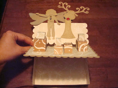


 Before I had even heard of digi stamps, I spent much of the winter & spring learning SCAL and researching orgamic architecture. I'm a total klutz with an X-ACTO, but my Cricut (with SCAL) gave me the opportunity to try some pop-ups.
I first discovered Extreme Cards & Papercrafting through a link to her pencil holder. I imported the image into SCAL and traced it. Then, I changed some of the elements to make my own version, which became a card for a friend's daughter who was coming home...and leaving for Law School. That simple card/pencil holder led to some nice bonding, so it has a particular place in my heart.
Since the cut file is just digital, I can cut it as many times as I like, which I do! I used it for some of my family Christmas cards.
My life was further changed by Extreme Cards' post about her
Naked Mole Rat magic picture card. I may have gone a little crazy with the idea! The magic cards are the right are a business card-sized version I made for a bookwarming party.

Last, but not least, I have to mention Passager, the literary journal & press I've been working with since 2003. Every single person I've worked with there has inspired me in many different ways. Our designer is Iranian-American and taught me about Yalda, the Persian celebration on the Winter Solstice. My family really enjoyed sharing a pomegranate on December 21st! So I made this pomegranate card for her...notice it opens the "opposite" way.
And if you're interested in bards, books & Baltimore, be sure to register for Passager's 21st Birthday Celebration, coming up in June. We'll be having readings and sharing books, and would love to meet you.
 I'm totally crushin' on the vintage images over at Create with Tlc, but I try to limit my use of free images. Then I realized that I have a small stash of vintage-y images that I purchased from ClipArt.com last year. I was going to use them for Marion Winik's website, as they match the images in a recent book, but then just ended up keeping them for some future project. And here's that project! One of these cards is going to Marion, especially since I think that technically she might have purchased the images for the project, and the other is going to the wonderful women at Passager. I'm going to be including invoices, but hopefully these cards are cute enough to soften the blow!
Concept aside, I love participating in color challenges because they really get me thinking about patterns, textures and interesting color combos. I went to the fantastic resource of Scrapmaster's Paradise for the color choices for these cards. For the first one I used their color combo #73, but for the second I used their groovy color combo generator. I love that the generator gives you the option of choosing one color you know you want to work with; in this case, I chose green because I wanted to use my new Pine stamp pad. I definitely will be revisiting both of these combos.


 Inspiration: Scrapmaster's Paradise Color Combo Challenge #73 & SP Color Combo Generator
Font: Speedball No. 3 by Nick Curtis
Image: Clipart.com
Rubber Stamp: Tiled Quad Cube by Stampendous!
Supplies: Recollections cardstock, ZipDry glue, Cricut personal cutter, SCAL2 software, HP printer & ink, Adobe InDesign & Photoshop, Offray ribbon, stash eyelet, Fiskars papercutter and decorative scissors, CraftSmart ink
Original inspiration for magic picture cards: Naked Mole Rat magic picture card by CPeep at Extreme Cards & Papercrafting
Magic Card tutorial: SplitcoastStampers
Magic card template for SCAL2 by cg-says
Because of my numerous failed attempts at the Make it Crafty Distressing challenge last week, I was very happy to see their new sketch & Vintage theme challenge. Another opportunity! I learned a lot following their instructions on distressing, mostly that it means more than I thought it did. I had made some really pretty paper with Tim Holtz distress inks, but then I messed it all up trying to use acrylic stamps on it. Too advanced for me (thus far!) This time I knew better. I embossed watercolor paper using a texturing plate and then "distressed" it using different inks. The key here applying the ink with a wet-nap wipe. For the orange stripes I spread on ink straight from the pad, which was risky but came out well.
 For whatever reason, I decided to use the cover of a book for the main image. Not just any book; a book I had the honor of designing. The whole experience was very important to me: I worked with the press's editors to design the cover and the poet is a favorite of mine. The card contains several elements that together tell the story of the cover's design: the smaller images are the two postcards I used as reference in the final design, the brads spell PB (for Passager Books, the publishing company), and the embossing plate and tool I used were gifts from the other designer, a good friend. I feel like the Crafter Me made a card for the Designer Me. She really appreciates it!
Inspiration: Make it Crafty sketch FUN challenge
Main image adapted from cover of Perris, California, poems by Norma Chapman (Passager Books, 2010)
Vintage Greetings from California postcard images: Travel version and Historic version
Supplies: brads from Around the Block, Tim Holtz Mustard Seed distress ink, ColorBox pigment ink, textured watercolor paper from PLAZA art stores, ZipDry glue, Fiskars papercutter, embossing texture plate & texturing tool
Blog title from "I'm Pedaling Backwards," Perris, Califonia, pg. 54
Duende has been on my mind this week, as I find myself surrounded by Spanish things. There was, of course, the World Cup win. I'm participating in a cool blogcandy challenge on Floral Fantasies, where the blogmistress is cruising the Med and taking us along vicariously.
 Today she's in Galicia, and I'm looking forward to following her down through Andalucia, birthplace of myself and, coincidentally, Federico García Lorca, the poet who brought the concept of duende into the international consciousness.
As creative concepts go, my favorite would have to be duende. It's an ancient Spanish word that has come to mean, roughly, "soul" as defined in American Blues and expressed in Jazz. Deep, deep Soul: the pain within the pleasure, the joy within the struggle. More here.
 When I think of the perfect physical representation of duende I think of castanets, the hand-held percussion section of flamenco dance. Since it's not very likely that I'll get my chance to be a castanets carver journeyman, I decided to make a little book out of paper. For inspiration, I had Jean L. Connor, one of my favorite poets of all time. The last poem in her newest book, A Hinge of Joy (Passager Books, 2009), contains the fantastic line "Why castanets, if not for joy?" and I've had the idea for this book since the first time I read it. She never ceases to inspire me.
Here's a quick look at my final castanets book. It's actually a little smaller than actual castanets! I'm going to change the final design to be the correct size, but for now it sits happily in the palm of my hand.
I was able to concave the paper slightly by using an easy dry debossing technique. The book just didn't look right completely flat. Notice the ribbon choice; anything not Spanish red and gold didn't look right either!
![cg says [something loudly]](https://blogger.googleusercontent.com/img/b/R29vZ2xl/AVvXsEj0FPmCZqXj2-YcQaqnchsA3zKcMX4MIsNrt-Q1wM9gJSyUJH_a6g_V1m_JKR0tKEOGU6F1AFBv8al43phB58tEMIPcT3G0wXzmJpswV9I5mFB7zOhpv8a8dpEAR6i9uS0mkOQKp_pC6PE/s1600/blogheader.gif)
 I had so much fun with the Airplane Rabbit from Zlatoena Designs that I made a couple of projects with another of her images, this adorable Parachute Rabbit.
 I whipped up the flap card on the left just for fun, and as you can tell I had lots of fun!


